Be Ok
Brand Identity | Editorial design | Social Media Design
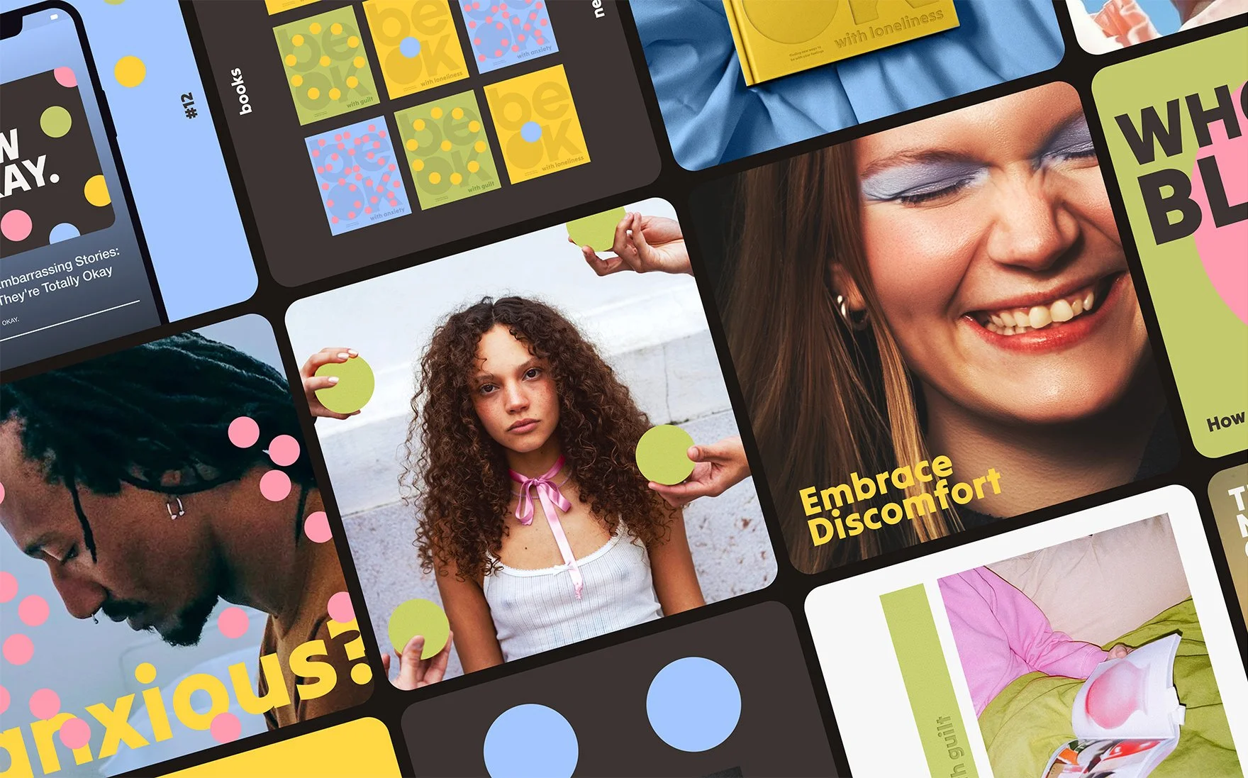
BeOk is a coffee table book series that turns emotional discomfort into something you can sit with — literally. Built around the idea that healing isn’t always soft or pretty, it uses punchy visuals, trypophobia-inspired motifs, and disarming language to create a tactile, thought-provoking space for Gen Z to explore what it means to be okay with not being okay.
Mentorship project with Trista Capitano
Industry: Wellness publishing


How it started?
Ironically, this project began as the very thing it now challenges: blank, clinical, and emotionally distant. I was following the usual blueprint of mental health branding — soft colours, calming copy, safe design. But it didn’t feel honest.
What was missing was realness — the kind that acknowledges that emotional pain doesn’t always look soft and pastel.


The Solution
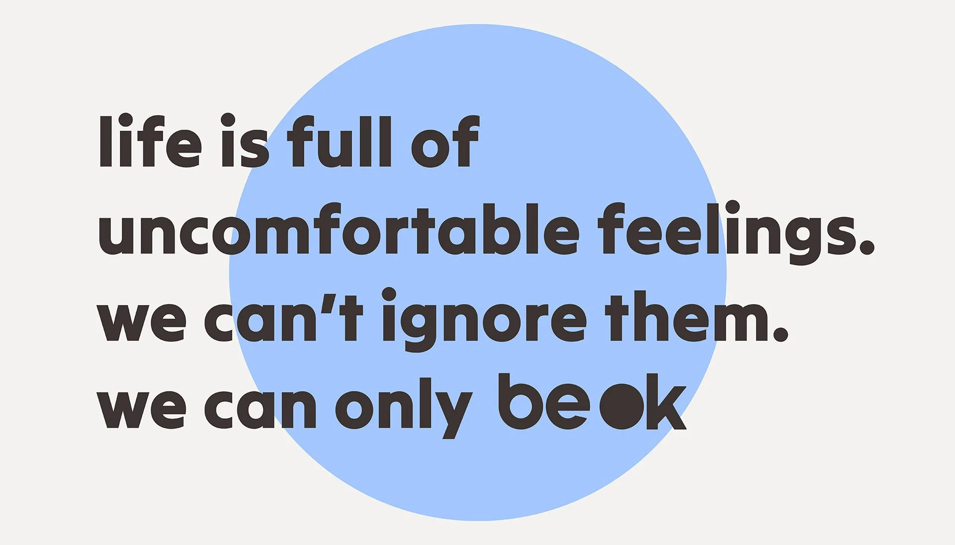
BeOk doesn’t shy away from discomfort — it leans into it. It invites you to take responsibility, reflect deeply, and be okay with feeling not-so-okay.
The branding is bright, punchy, and a little bit weird — on purpose. The use of circles draws from trypophobia, the discomfort people feel when seeing repetitive holes or patterns. It’s a subtle visual metaphor for emotional unease — and a direct way to compel different, sometimes conflicting, feelings.


The New Okay | Podcast

Process
I always start with research, then move to paper. In my notebook, I explore ideas, connect dots, and identify a general direction. From there, my thoughts quickly move to Figma, where I build moodboards and begin digital sketching.
